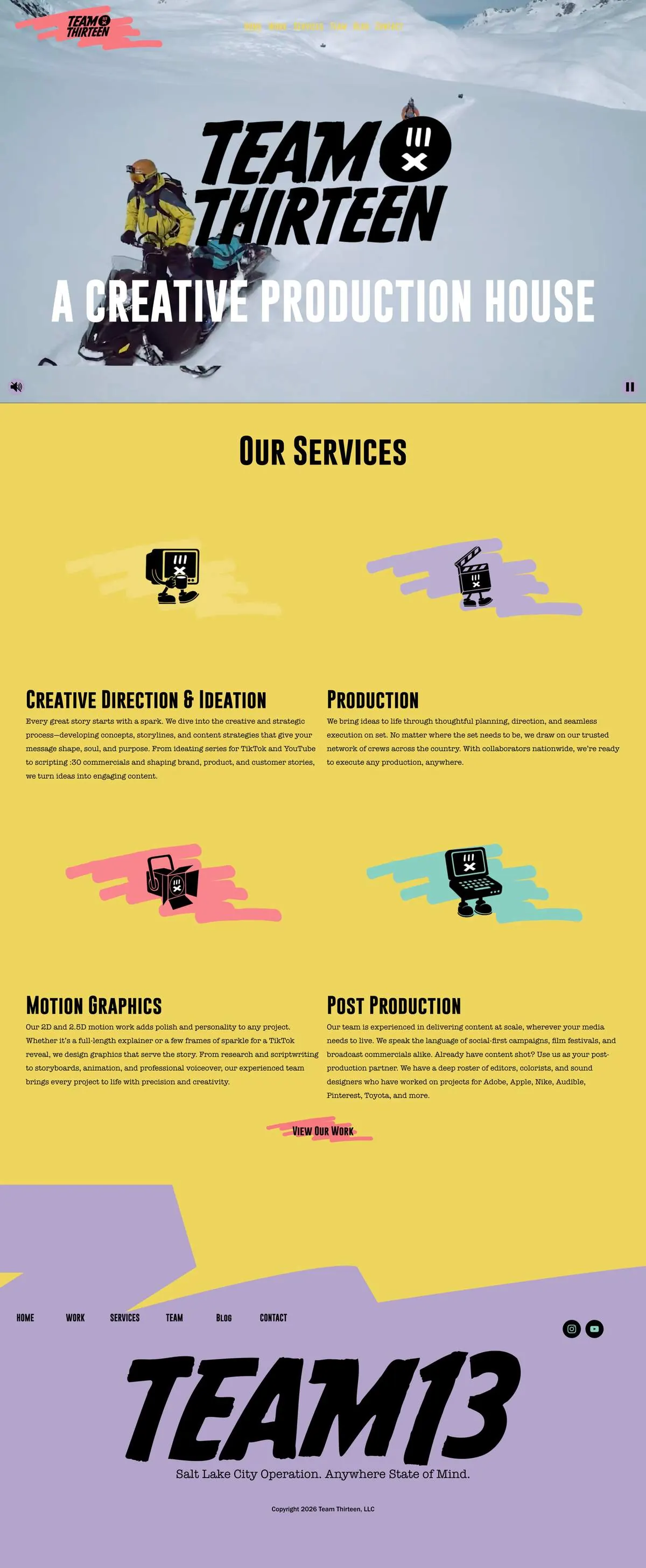
Team 13
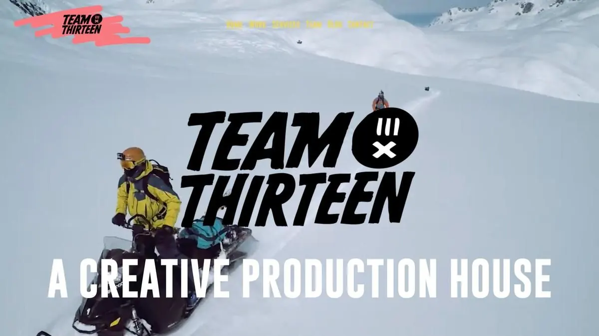
A motion studio’s site has to look like it was designed by one.
Team Thirteen is a video and motion graphics production company in South Salt Lake, Utah. Their site had been started in Readymag by one designer, who stopped responding partway through, and finished by another who hadn’t worked from their brand guidelines. By the time it was ready to launch, nobody at the company wanted it to go live.
- Client
- Team Thirteen
- Industry
- Video & motion graphics
- Based in
- South Salt Lake, UT
- Moved from
- Readymag
- Built on
- Squarespace + custom code
The starting point
The site had been pieced together by two different designers. Fonts changed from page to page, a white logo floated over the hero video like a ghost, and the full-screen video Readymag could manage came out so compressed it looked worse than the footage deserved. The menu couldn’t stay pinned while scrolling, and the work was split into buckets like product stories and reels that visitors had to click through to find anything.
Readymag itself was part of the problem. It’s easy to use, but hard to find anyone who knows it well, and every new project meant fighting it. The team wanted a platform they could keep adding work to, that would also give them a real shot at showing up in search.
What they asked for
- A full-screen, full-quality video hero with the menu pinned to the top
- One work grid of tiles instead of category buckets
- Vertical and horizontal videos mixed together, because vertical says “we do social” at a glance
- A page for every project with an overview, crew list and behind the scenes
- A consistent footer with their address, Instagram and YouTube on every page
- Their brand characters used throughout, so the site feels like them
What we built
Matt, who ran the project on their side, was open to starting over, so we did. I designed the pages in Figma first and we went back and forth on the homepage until the team signed off, then built it on Squarespace, which kept the design debates out of the build.
The homepage opens on their reel at full resolution with the navigation fixed on top. The work page is a single grid where vertical and horizontal videos sit side by side, and each card plays its video on hover, including YouTube Shorts, then opens a project page with the overview, crew and behind-the-scenes footage. Custom code handles the hover playback and the playful motion that ties back to their characters, and the brand guidelines now drive every font and color on the site.
Because it’s Squarespace, adding a new project is a matter of duplicating a page and dropping in the video, not tracking down a Readymag specialist.
The result
Launched in March 2026, it’s a site the whole team was ready to put their name on, with the work front and center and a structure they can grow themselves. In Matt’s words on Google: “Dylan is patient and easy to work with. Highly recommended!”